8/10 Composition (Preview)
Using a view finder to crop and make interesting use of negative space, employing colour, pattern and tone.

LESSON PREPARATION
Getting ready to view the lesson
If you are watching the video tutorial on a computer (eg laptop, interactive whiteboard, digital projector) you can view the PDF resources on the screen.
If you are watching the video tutorial on a television, you may want to print the Workshop PDF on this page ahead of time, from your computer.
This lesson, Still Life 8/10, contains the following:
Still Life 8/10 Lesson Overview
Still Life 8/10 Activity
Still Life 8/10 Extension
Still Life 8/10 Posters (available in PDF)
These are posters of the finished artworks as created in the episode. You can choose to view this on the screen or whiteboard, you can print in black and white, or colour, or all of the above.
MATERIALS USED IN THIS LESSON
Willow charcoal, compressed charcoal, coloured dry pastel, kneadable and plastic/vinyl erasers.


EQUIPMENT USED IN THIS LESSON
Drawing board, clips, easel, view finder and spot light.


SUBJECTS USED IN THIS LESSON
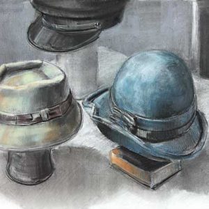
Assortment of hats varying in shape and colour. Feel free to set up any objects you have at hand for this exercise, or choose something from our virtual subject library and zoom in to focus on a particular part of the Virtual Subject choose your composition.
1. A view-finder is a fantastic tool for the compositional framing of any subject. The frame will help you decide what part of the subject you will use, and where it will sit on your page before you even begin.
2. Through the viewfinder, you can view not just the objects but the negative space between the objects, and the background.
3. For good composition, ensure the various elements in the frame are pleasantly varied in shape and direction. Try to keep your viewer’s eye travelling in a circuit around your composition. Avoid strong lines that force the eye off the page.
4. The eye is easily distracted by the same size and shape, which is why strong forms that split the page down the middle are so powerful, and potentially disastrous for a composition. Strong diagonal lines flying out the corner of the page also tend to take the viewer with them.
5. Using a view-finder is one way to compose, and the other is to simply start drawing, and create balance by adjusting strength of elements as we go.
6. For this drawing, we start with our charcoal on its side, gently mapping in the hats. Keep referring to the view-finder to establish your composition.
7. You might well crop the composition quite closely with the view-finder, and focus only on a section of the whole, as has been done here.
8. Once the composition is established, bigger areas can be blocked in.
9. The charcoal can be pushed around using a torchon, an eraser, a brush or the side of your hand once it is down on your paper. We can define the textures that accurately describes the materials of our still life using these tricks of manipulation.
10. Use the torchon to produce directional planes in the surface of the charcoal.
11. Light can be erased into our hats with a kneadable eraser and then cut in with a sharp or cut vinyl eraser.
12. Dark lines strengthen the areas of detail.
13. Remember to give shadows and blocks of background due strength.
14. The dark hat going out the top of the composition has been left under-drawn, so as to not lead our eye out the top of the composition.
15. Composition is about orchestrating exactly where we want viewers to look.
16. This drawing could be happily left at the black and white stage, but let’s add some colour.
17. Dry pastels can go over unfixed charcoal, to produce a soft tonal result, and colours can be mixed with a torchon to blend the charcoal with the pastel.
18. Strong use of highlight pastel adds sharpness and detail, and compressed charcoal can be used for stronger black marks to finish off the drawing.
19. Colour and strong detail grabs attention to balance out the dark hat going out the top of this drawing.
20. Shapes of background and shadow are given a final look of attention. Ask yourself, “Are they the right strength? Do they distract from the overall balance of elements?” It is critically important to consider these aesthetic questions when composing your drawings. Don’t get lost in detail. Always consider the whole picture as you progress your work.
Set up a still life featuring colour, make sure the light source creates strong contrast and use your view finder to produce a composition.
1. Cut a view finder that is longer and thinner than the proportion of your paper, this will result in a band of drawing across your page.
2. Set up lots of objects and draw only a small section, this strong cropping can produce more abstract results.
3. Colour could also be used to block in the bigger shapes of the composition, colour may represent a tonal value, before line is brought in to sharpen up the subject.
4. Small items could be drawn quite big, cut a small view finder say 5 x 7 cm and explore a smaller setting trying to imagine that they are huge items, and weigh tones.
5. Set up a small still life on 2 or 3 different types of printed fabrics or strongly patterned objects.
Video Tutorial


Download the PDF of this Workshop